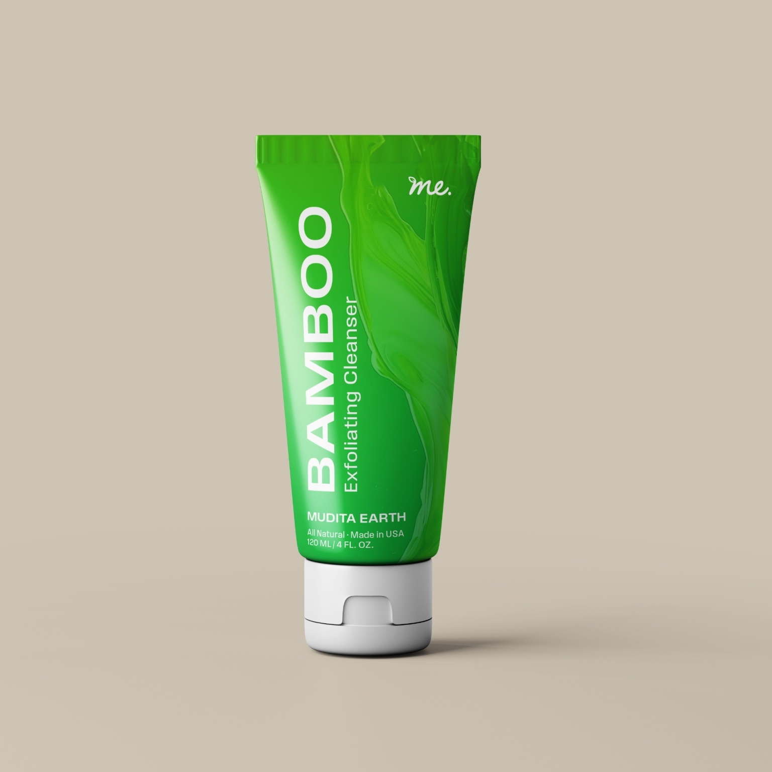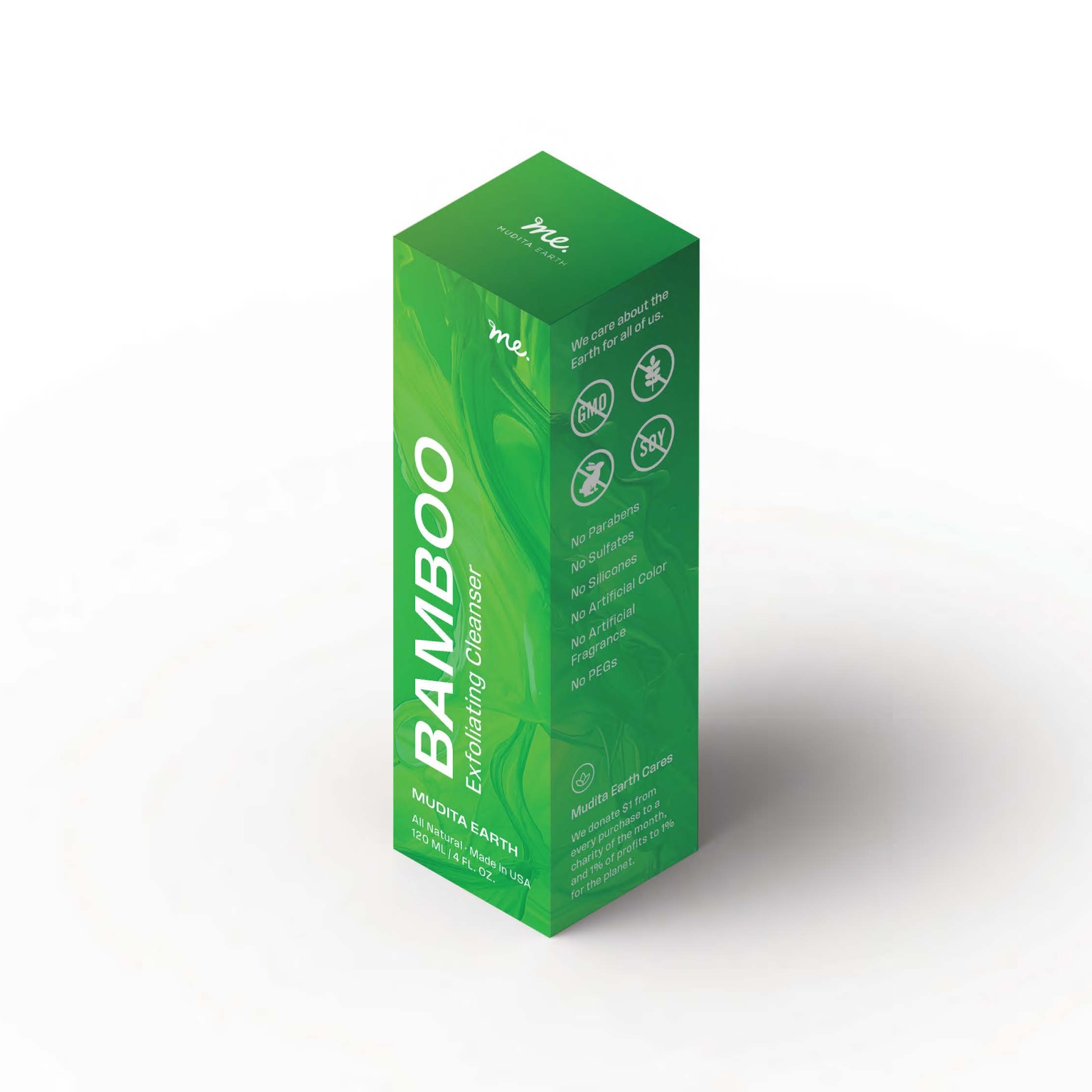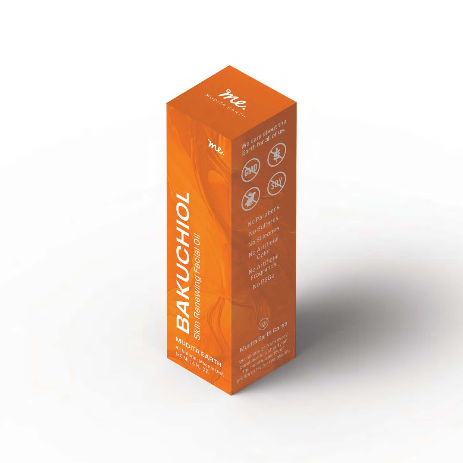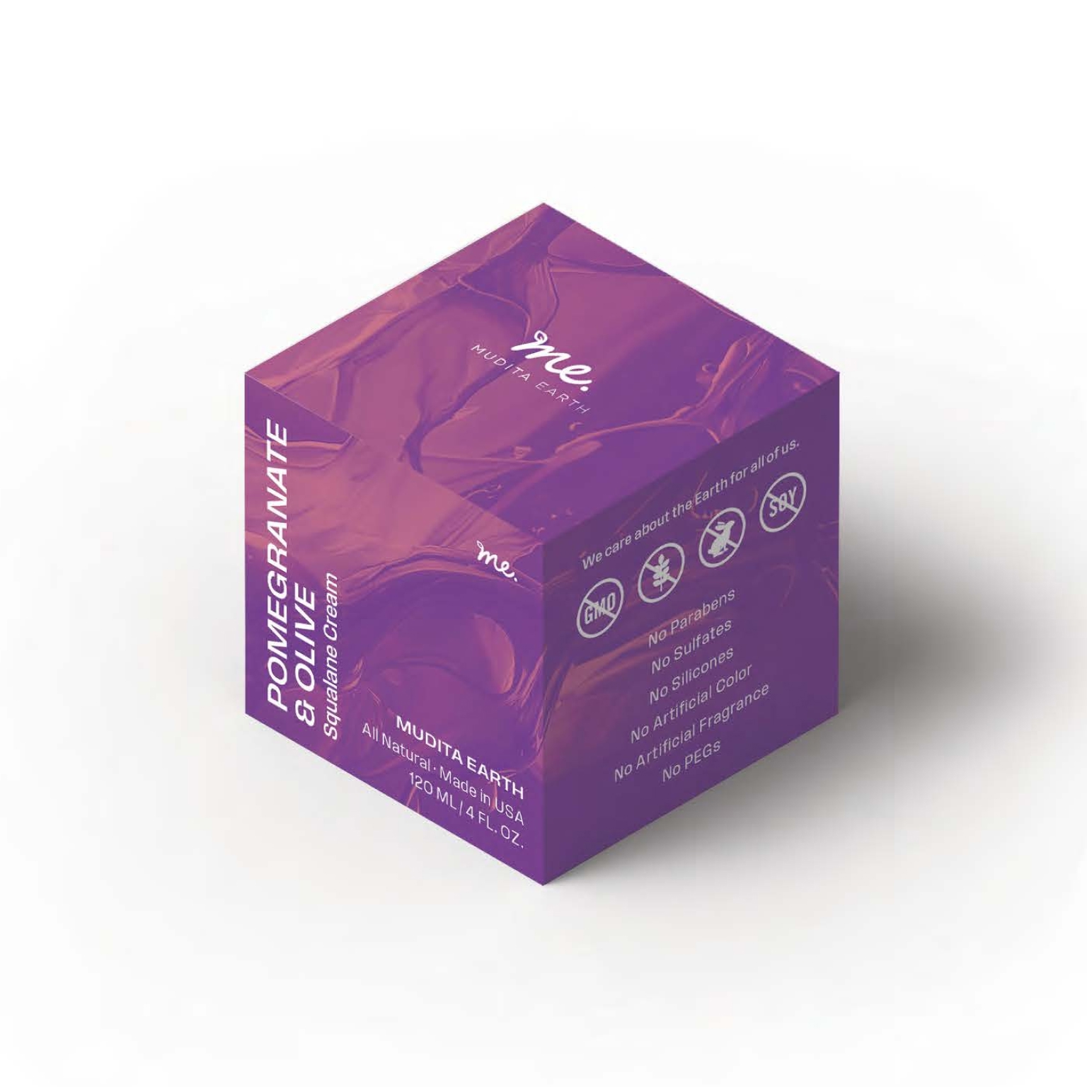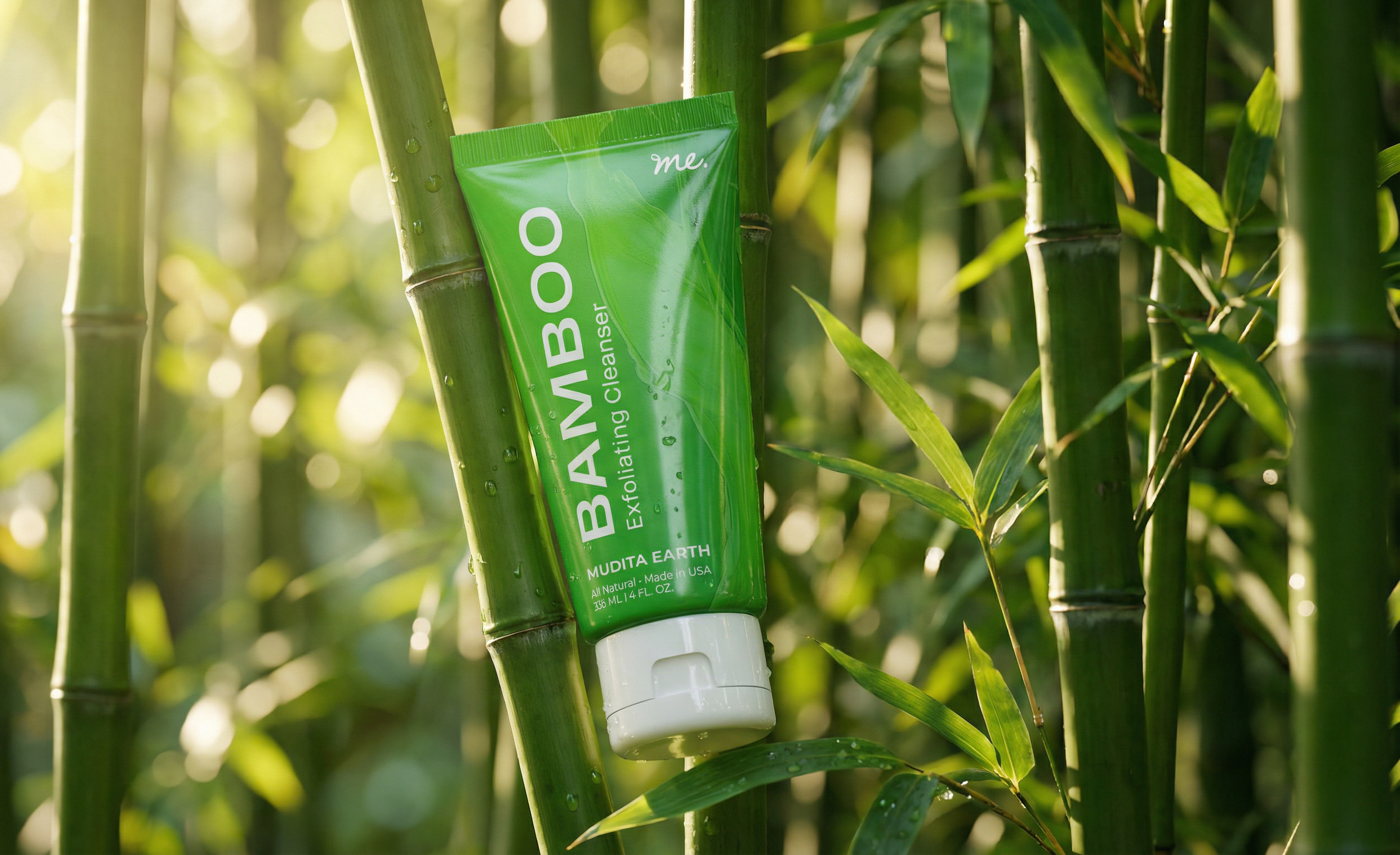
Mudita Earth came to me with an existing line of natural skincare products and a packaging problem. The labels were generic — flat, interchangeable, forgettable in a category where shelf presence is the first conversion point. More critically, the brand's core differentiator — its naturally derived, food-grade ingredients — was invisible on pack. The formulations were genuinely distinctive, but the packaging wasn't doing any of the selling.
I was brought in initially to redesign the packaging for their existing SKUs. Rather than a cosmetic refresh, I pushed the creative toward a bolder visual language: vibrant, ingredient-led color palettes, large-format product-name typography rotated vertically for maximum shelf impact, and a fluid ink texture system that gave each SKU its own identity while holding together as a cohesive family. The ingredient story — Bamboo, Pineapple & Rosehip, Blueberry & Papaya, Bakuchiol — moved to the front and center, functioning simultaneously as product name, flavor cue, and ingredient credential. The result was a line that read as premium and natural without retreating into the muted minimalism that saturates the clean beauty space.
I was brought in initially to redesign the packaging for their existing SKUs. Rather than a cosmetic refresh, I pushed the creative toward a bolder visual language: vibrant, ingredient-led color palettes, large-format product-name typography rotated vertically for maximum shelf impact, and a fluid ink texture system that gave each SKU its own identity while holding together as a cohesive family. The ingredient story — Bamboo, Pineapple & Rosehip, Blueberry & Papaya, Bakuchiol — moved to the front and center, functioning simultaneously as product name, flavor cue, and ingredient credential. The result was a line that read as premium and natural without retreating into the muted minimalism that saturates the clean beauty space.